What Is Mobile-First Design?
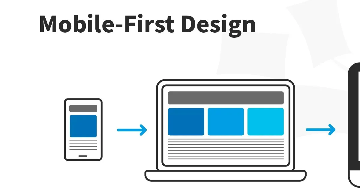
Mobile-first design is a strategy that begins by designing for the smallest, most constrained screen — the mobile phone — and then progressively enhances the design for larger screens like tablets and desktops.
It is the direct opposite of "graceful degradation," the older approach of designing for desktop first and then removing or reorganising elements to fit smaller screens. Mobile-first design starts from the smallest viewport and adds complexity as space allows.
Why Mobile-First Is Now Non-Negotiable
Traffic: Mobile devices account for over 60% of global web traffic. In India, that figure is higher still — mobile is the primary internet access device for the vast majority of users.
Google's mobile-first indexing: Since 2020, Google uses the mobile version of your website as the primary version for indexing and ranking. If your mobile experience is poor, your SEO suffers regardless of how good your desktop site is.
User expectations: For millions of people in Kerala and across India, their smartphone is their primary device for accessing the internet. Designing for them is not an accommodation — it is designing for your primary audience.
The Mobile-First Design Process
1. Content Hierarchy First
Mobile's limited screen space forces a critical question: what is the most important thing on this page? Every piece of content must earn its place. This discipline almost always makes the desktop design better, too.
2. Touch-Friendly Interaction Design
Mobile users navigate with thumbs, not mouse pointers:
- Tap targets should be at least 44x44px — Apple's HIG minimum
- Links in body text should be avoided or given extra padding
- Hover states don't exist on touch — any information only shown on hover is invisible to mobile users
- Swipe gestures are more natural than tap-to-expand on mobile
3. Performance as a Design Constraint
Mobile networks are significantly slower than broadband. Mobile-first design means:
- Optimising and compressing all images before uploading
- Loading only needed font weights
- Using modern image formats (WebP) for smaller file sizes
4. Progressive Enhancement in CSS
Mobile-first CSS is written with mobile styles as the default and desktop styles added with min-width media queries:
/* Mobile: the default */
.container { padding: 1rem; }
/* Tablet and above */
@media (min-width: 768px) {
.container { padding: 2rem; }
}
/* Desktop */
@media (min-width: 1200px) {
.container { max-width: 1200px; margin: 0 auto; }
}
Mobile-First Navigation Patterns
Hamburger menu: The most common pattern. Navigation collapses into a menu triggered by an icon.
Bottom navigation: Puts primary navigation at thumb-reach — the most ergonomic position on a phone.
Priority+ pattern: Show as many navigation items as space allows, collapsing the rest into a "more" menu.
Testing Mobile-First Designs
Real device testing is irreplaceable. Test on at least:
- A flagship iPhone (Safari behaviour)
- A mid-range Android device (Chrome on Android)
- A low-end Android device (performance reality check)
Conclusion
Mobile-first design is not a technical approach — it is a user empathy approach. It starts from a commitment to serve users in their actual context, on their actual device. When done well, it produces websites that perform better for everyone — mobile users because the experience was designed for them, desktop users because the constraints of mobile-first thinking make the desktop design cleaner, faster, and more focused.